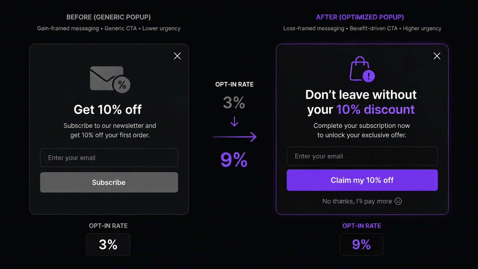
- Five elements determine popup conversion: headline, offer, CTA copy, close button design, and visual layout.
- Loss-framed headlines ("Don't leave without your 10% discount") lift opt-in rates versus direct benefit frames in A/B tests.
- Percentage discounts off first orders convert higher than newsletter access — specific always beats vague.
- Replacing "Subscribe" with "Claim my 10% off" is the single fastest CTA improvement with no design changes required.
- A visible close button is a trust signal, not a conversion enemy — hiding it violates FTC guidelines and kills repeat visits.
- Single-column mobile layout and maximum two form fields are non-negotiable for mobile opt-in rates.
What Are the 5 Elements That Determine Popup Conversion Rate?
Most Shopify merchants optimize their popup trigger — the timing, the exit intent threshold, the scroll depth — without ever fixing the popup itself. Trigger optimization is a 5–10% improvement lever. Fixing all five design elements is a 2–4x improvement lever. Here is what each one does and why it matters.
1. Headline — the first thing a visitor reads. If it doesn't state the offer or create immediate curiosity, the visitor dismisses the popup in the first second before processing the rest. A generic headline like "Wait!" or "Stay in touch!" is not a headline — it's a placeholder.
2. Offer — the reason to act. Specificity is the entire variable. "10% off your first order" converts higher than "exclusive deals" because it answers the visitor's immediate question: what do I get? Vague offers create vague motivation.
3. CTA copy — the button label. Generic verbs ("Subscribe," "Submit," "Join") have no motivational weight. First-person possessive phrases ("Claim my 10% off," "Get my discount") create the psychological sensation of already owning the reward before clicking. That shift reduces commitment friction.
4. Close button design — the trust signal. A visible X in the top-right corner tells visitors they are in control. It sounds counterintuitive, but making it easy to leave is what makes visitors comfortable enough to stay and read your offer.
5. Visual design — the layout, contrast, and field count. High-contrast button color, single-column mobile layout, and a maximum of two form fields are the three variables that matter most. Everything else is aesthetic preference.
Which Headline Formulas Work Best for Shopify Popups?
Popup headlines have about 1.5 seconds to communicate enough value to prevent dismissal. Three formulas consistently outperform everything else. The right one depends on your offer and your brand voice.
Formula 1: The Direct Benefit
State the offer in plain language. No cleverness, no curiosity gap — just the value, upfront.
Formula 2: The Loss Frame
Reframe the offer as something the visitor is about to lose by leaving. This activates loss aversion — the psychological finding that losses feel roughly twice as powerful as equivalent gains feel pleasurable, documented in Kahneman and Tversky's Prospect Theory (1979). Loss-framed headlines consistently outperform direct-benefit headlines in A/B tests, typically by 8–15% lift in opt-in rate.
For a deeper look at how loss aversion applies across all Shopify touchpoints, the urgency marketing psychology guide covers the full Prospect Theory framework with before/after copy examples.
Formula 3: The Curiosity Hook
Create a gap between what the visitor knows and what they think you're about to tell them. This works best when your offer is unusual or when you're targeting a specific segment.
Which Popup Offers Convert Best? (Ranked by Opt-In Rate)
The offer is the single highest-leverage variable in popup design. Every other element — headline, CTA, design — is amplifying or diminishing the offer's pull. Here are the four main offer types ranked by average opt-in rate, based on aggregate data from Wisepops and OptiMonk across millions of popup displays.
- Percentage discount off first order — highest opt-in rate. Specific, immediate, and universally understood. "10% off your first order" wins in almost every category.
- Free shipping threshold unlock — high opt-in for AOV-focused stores. "Free shipping on orders over $50" is compelling for stores where shipping cost is a real friction point. Works best when your current threshold is close to your average cart value.
- Free gift with purchase — high opt-in for subscription and CPG brands. Physical reward feel outperforms percentage discount when the gift has perceived value. "Free sample with your first order" works well for beauty, wellness, and food brands.
- Exclusive deals / newsletter access — lowest opt-in. "Join our community" and "Get exclusive updates" are offers in name only. They state no concrete value. Reserve this approach only if your brand has enough existing loyalty that access itself is the reward.
1. Specific beats vague — "10% off" outperforms "exclusive deals" every time
2. Discount beats newsletter — tangible reward beats intangible membership
3. Single offer beats multi-offer — "10% off OR free shipping OR a free gift — choose!" reduces conversion because it introduces a decision step before the primary conversion event
For a full breakdown of how popup types and trigger timing work together, see the popup guide covering timing, triggers, and strategy by store stage.
5 CTA Copy Rewrites That Lift Conversions Immediately
CTA button copy is the easiest fix in popup design: no design changes, no new creative, just different words. The principle is consistent across every test: first-person possessive phrasing ("my discount," "my 10% off") creates the sensation of ownership before the visitor clicks, reducing the psychological cost of committing. Generic verbs create no such sensation.
Here are five before/after rewrites you can apply today, plus the loss-framed decline link that belongs below every CTA button.
The decline link rewrite is the most underused improvement in popup design. "No thanks" is frictionless — it carries no weight. "No thanks, I'll pay full price" makes the cost of dismissal explicit. It doesn't trap the visitor; the option to close is still right there. It just makes the trade-off visible. For a deeper read on how this connects to loss aversion in the context of exit intent popup strategy, the dedicated guide covers trigger configuration alongside copy.
Review your email popup best practices to ensure your copy changes pair with the right timing and trigger settings — CTA copy and trigger timing work together, not in isolation.
Close Button Design: The Micro-Psychology of Trust
The close button is not the enemy of conversion. It is a trust signal. Visitors who know they can leave feel safe enough to read your offer. Visitors who sense they're being trapped skip reading entirely and look for any way out.
The standard is a small X in the top-right corner of the popup. This is where visitors look first. Place it there, make it visible, and size it large enough to tap on mobile (minimum 44×44px touch target). Do not style it as an invisible element, do not color it to match the popup background, and do not remove it.
The FTC's 2022 "Bringing Dark Patterns to Light" report identifies popups that make dismissal unreasonably difficult as deceptive practices. Beyond regulatory risk, a hidden close button destroys the trust required for conversion. A visitor who can't find the X closes the browser tab — and doesn't come back.
✓ Small X, top-right corner — standard position, expected by visitors
✓ Visible contrast against popup background — not invisible, not hidden
✓ 44×44px minimum touch target on mobile — FTC and usability requirement
✓ Loss-framed decline text below CTA button — a separate persuasion layer, not a replacement for the X
✗ Never make the X hard to find, microscopic, or the same color as the background
✗ Never remove the X and rely only on clicking outside the popup to close
For social proof on how trust signals affect overall store conversion, not just popup performance, see the social proof guide.
Visual Design Rules for High-Converting Shopify Popups
Design decisions that affect conversion come down to five rules. Everything else — border radius, drop shadow depth, background texture — is aesthetic and has minimal measurable conversion impact.
1. Match Your Brand Colors
A popup that looks like it belongs to a different website reduces trust before the visitor reads a single word. Your popup should use the same primary color, font, and visual register as your store. PopBoost's "Match store theme" feature reads your active theme palette and applies it automatically — so the popup feels like a native part of your store, not an overlay from a third-party tool.
2. Single-Column Layout on Mobile
Multi-column popup layouts break on mobile. A two-column layout with an image on the left and a form on the right becomes illegible on a 390px screen. Use single-column for all popups. If you want to include a product image, place it above the headline, not beside the form. Mobile is where more than 60% of Shopify traffic originates — designing for desktop first is designing for the minority.
3. Image Optional, Never Required
Product images in popups can increase perceived value for specific product-linked offers ("Get this bundle for 20% off"). But an image is not required for a discount popup. A clean, copy-focused popup with a strong headline and high-contrast CTA button will match or outperform an image popup in most A/B tests. Add an image only if it reinforces the offer — never as a default aesthetic choice.
4. Maximum Two Fields
Email is the required field. First name is the optional field, used for email personalization. That is the maximum. Every additional field — phone number, birthday, company name — reduces opt-in rate by an estimated 10–15% per field. Do not add a second step ("Step 1 of 2: Enter your email") to a first-popup email capture — multi-step flows belong in post-purchase surveys, not acquisition popups.
5. Button Contrast
The CTA button must be the highest-contrast element in the popup. If your popup background is white and your button is light gray, the button disappears visually. If your popup background is dark and your button is a muted dark purple, same problem. Test your popup on a mobile screen at arm's length: if the button doesn't immediately draw your eye, the contrast is insufficient.
Design popups that match your store in 60 seconds
PopBoost's popup editor includes pre-built templates, a color picker that reads your Shopify theme palette, and field customization for email and first name. Set up your exit-intent popup or discount capture popup without touching code — all 7 conversion widgets, one app.
Install PopBoost free →14-day free trial · no credit card required · works with all Shopify themes
How to Use PopBoost's Popup Editor to Apply These Rules
PopBoost's popup editor is built around the five conversion elements covered in this post. Here is how each maps to the editor interface.
Templates: Start from a pre-built template categorized by goal — discount capture, email list growth, exit recovery. Each template is structured to the single-column, high-contrast pattern described above. Use a template as your starting point and customize copy, not layout.
Color picker: The "Match store theme" button reads your active Shopify theme's color variables and applies them to the popup background, text, and button. Run this before customizing anything else. It eliminates the most common visual trust problem — popups that look like foreign objects on your store.
Field customization: The editor defaults to email only. Add the first name field if your email platform (Klaviyo, Mailchimp, Omnisend) uses first-name personalization in flows — otherwise leave it off. Never add a third field. The editor does not allow more than two fields in the capture form for this reason.
CTA and decline copy: Both the button label and the decline link text are editable in the same panel. Change the button from "Subscribe" to "Claim my 10% off" and the decline link from "No thanks" to "No thanks, I'll pay full price" — these two edits take under 60 seconds and are the highest-ROI changes in the entire editor.
For how popup design fits into the broader conversion toolkit — including social proof, countdown timers, and free shipping bars — the urgency marketing psychology guide covers how each element works together.
Frequently Asked Questions About Shopify Popup Design
What makes a Shopify popup design convert?
Five elements working together: a headline that states the offer immediately, a specific and tangible offer (percentage discount over newsletter access), CTA button copy using first-person possessive phrasing ("Claim my 10% off" over "Subscribe"), a visible close button that signals trust, and a single-column mobile layout with high-contrast button and maximum two form fields. Getting all five right pushes opt-in rates from the 3% average to 8–12%.
Which popup headline formula performs best?
Loss-framed headlines ("Don't leave without your 10% discount") consistently outperform direct-benefit headlines ("Get 10% off") in A/B tests — typically by 8–15% lift. The loss frame activates Prospect Theory's loss aversion mechanism: losses feel roughly 2x more painful than equivalent gains feel pleasurable. Test the direct benefit as baseline, then run the loss frame as the challenger.
What popup offer should I use on my Shopify store?
Percentage discount off first order converts highest across most store categories. Free shipping threshold unlock is strong for stores where shipping cost is a real checkout friction point. Free gift with purchase works well for beauty, wellness, and subscription brands. Newsletter or "exclusive deals" access converts lowest because it provides no tangible immediate reward. Use one offer only — multi-offer popups reduce conversion by introducing a choice step.
How do I write better CTA button copy for a popup?
Replace generic labels with first-person action phrases that name the exact reward. "Subscribe" becomes "Claim my 10% off." "Sign up" becomes "Get my discount." "Submit" becomes "Yes, I want free shipping." The pattern: action verb + possessive pronoun + specific reward. Also replace the decline link: "No thanks" becomes "No thanks, I'll pay full price" — making the cost of dismissal visible without removing the visitor's ability to leave.
Should I hide the close button to prevent visitors from dismissing my popup?
No. A visible close button is a trust signal — visitors who know they can leave feel safe enough to read your offer. The FTC's 2022 "Bringing Dark Patterns to Light" report identifies popups that make dismissal unreasonably difficult as deceptive practices. Practically, a hidden or obscured close button causes visitors to close the browser tab rather than the popup — losing the session entirely. Place a visible X in the top-right corner and add a loss-framed decline text link below the CTA button as your persuasion layer.
Further reading: the popup guide covers trigger types and timing strategy, the exit intent popup guide goes deep on cursor-leave configuration, email popup best practices connects capture to Klaviyo flows, the social proof guide covers trust signals beyond popups, and the urgency marketing psychology guide explains the full loss aversion and scarcity framework.
