Most Shopify founders ask the same question: "My traffic is decent, but why won't people buy?" The answer is almost never pricing, design, or product quality. It's structure. Whether you sell skincare, coffee, supplements, or dog food, shoppers need guidance before they commit. Without it, they browse, hesitate, and leave.
The seven tactics below are structural fixes. They don't require a rebrand or a developer. Each one addresses a specific dropout point in the purchase journey, and each works the same way across categories, from a $22 candle to a $180 apparel bundle. The mechanics of hesitation are universal.
What Is a Good Conversion Rate for a Shopify Store?
The average Shopify store converts at 1.4% (Shopify, 2024). Top-quartile stores hit 3–5% by combining guided selling, a personalized product quiz, with an automatic bundle incentive at checkout. Without these two elements, most stores stay stuck at 1.2–1.8% because shoppers face too many choices with too little guidance.
| Store Type | Avg CVR | Top Quartile CVR |
|---|---|---|
| All Shopify stores | 1.4% | 3.2% |
| Health & beauty DTC | 1.9% | 4.1% |
| Food & beverage | 2.1% | 5.8% |
| Apparel & accessories | 1.2% | 2.9% |
Benchmarks vary by category, but the ceiling is much higher than most stores achieve. Quiz-driven personalization compounds with bundle incentives in almost every vertical, because the underlying problem is the same everywhere: shoppers land on a page, face a wall of choices, and can't decide which product is right for them.
A skincare customer who tells you they have oily, acne-prone skin has given you enough to recommend a specific cleanser, a serum, and a moisturizer that pair together. A coffee buyer who says "dark roast, espresso machine" gets a matched trio. Any catalog with meaningful variety produces that level of purchase-relevant signal from a five-question flow.
Tactic 1: Replace Category Browsing With a Guided Product Quiz
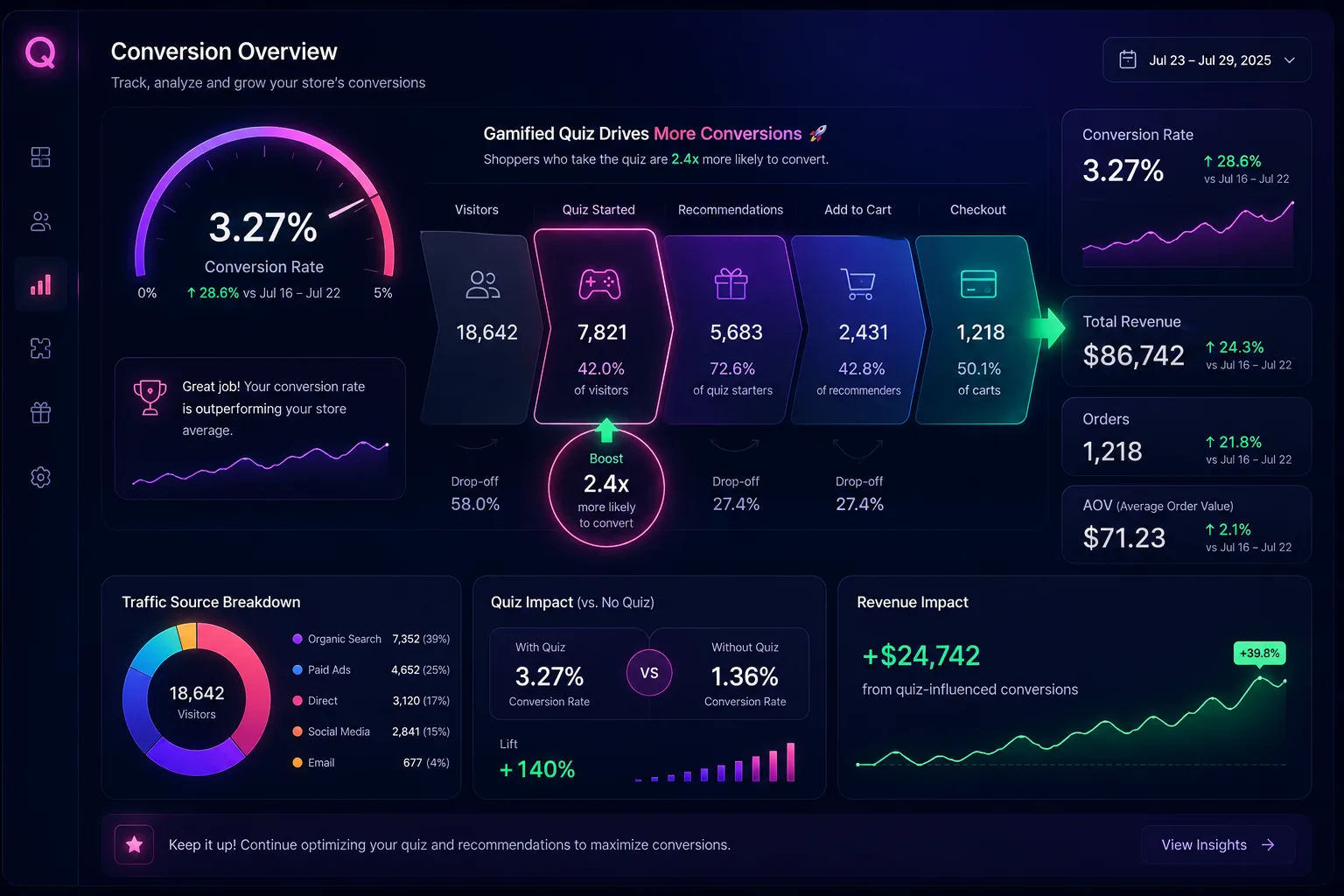
Quiz completers convert at 4–8% vs. 1–2% for browse-and-buy visitors (Quizzo merchant data). That's a 3–4x lift from one structural change: replacing a passive navigation experience with an active guided flow that ends in a recommendation.
Why does browsing underperform so badly? Category browsing forces the customer to make multiple sequential decisions: which product type, which variant, which combination. Each decision is a potential dropout point. A shopper who faces 14 serums and doesn't know which one suits their skin will click away. It's not that they don't want to buy. It's that you've handed them a problem instead of a solution.
A quiz inverts this dynamic entirely. One flow, five questions, one recommended output. Choice paralysis drops from a browsing problem to a solved problem. The customer doesn't choose between products, they answer questions about themselves, and the quiz tells them what fits.
A Quizzo quiz captures the few attributes that actually drive the purchase, roughly five questions and 90 seconds of the customer's time. Answers feed a gamified flow: the shopper earns coins, spins a prize wheel, wins a reward, and lands on a curated bundle. The output is a tailored set of products, not a filtered category page. A filtered page still shows 6–8 items. A recommendation shows 2–3, pre-matched to the answers.
You can build the quiz by hand or auto-generate it from your existing catalog, so a store with hundreds of SKUs is not a blocker. For a deeper look at the conversion mechanics, see how a Shopify product quiz doubles conversion rate.
Tactic 2: Surface the Bundle Discount Before Checkout
Most merchants show the bundle discount in the cart or at checkout. The better placement is the quiz results page, immediately after the recommendation, when the customer is at peak engagement and the bundle still feels like advice.
A "Complete your routine, add one more item and save 15%" prompt on the quiz results page drives 22% higher multi-item attach rates than showing the discount only at checkout. The psychology is straightforward: the customer has just received their personalized recommendation. They're engaged. That's the moment the bundle offer is most persuasive, not three minutes later when they're reading a checkout summary and second-guessing the total.
Late-stage discounts feel like a last-ditch upsell. The customer notices, and it reads as desperation. An early-stage bundle prompt feels like a natural extension of the recommendation: "You've got the cleanser, the moisturizer pairs with it and you save 15% together." That's a genuinely helpful framing, not a sales tactic. With Quizzo, the reward from the prize wheel becomes the bundle discount, so the incentive is baked into the flow.
A Shopify Function auto-applies the bundle discount at checkout, no coupon codes, and the reward is clamped to a merchant-set maximum (for example, 15%) so you never over-discount. For the technical mechanics, see how automatic bundle discounts work on Shopify.
Tactic 3: Add Social Proof at the Product Decision Moment
Generic homepage reviews convert less effectively than specific proof at the exact decision point. "4.9 stars, 1,240 reviews" in the site header is background noise. A review from someone with the same profile as the quiz-taker, shown at the moment of decision, is active persuasion.
Segment-specific reviews on quiz results
Show reviews from customers who match the quiz-taker's answers. "As someone with oily, acne-prone skin, this serum finally cleared me up" is worth 10x a generic five-star review to another oily-skinned shopper. The specificity creates instant identification. The customer recognizes themselves in the reviewer's situation, whatever the category.
Most review platforms let you tag reviews by customer attributes or filter by keyword. Pull the language that matches each quiz segment (skin type, roast preference, breed, fit) plus outcome-specific phrases ("cleared my skin in three weeks") and surface those reviews on the matching quiz result variants.
Volume signal on the quiz CTA
"2,400 shoppers found their match this month" on the quiz entry point adds social pressure to participate. It positions the quiz as a popular, trusted path rather than a sales mechanism. Most brands put volume signals on product pages ("1,200 sold"). Put it on the quiz CTA instead. You're telling the customer that taking the quiz is the thing everyone does, not just that a product is popular.
Outcome language in reviews
Reviews that describe outcomes convert better than product-quality reviews. "I finally stopped breaking out" lands differently than "great packaging, fast shipping." Outcome language speaks to the customer's actual purchase motivation, whether that's clearer skin, a better morning cup, or a calmer dog. If you have outcome-language reviews in your database, prioritize surfacing them on the quiz results page and product pages over quality-language reviews.
Tactic 4: Speed Up the First Decision With a Single Quiz CTA Above the Fold
A homepage with a single primary CTA, "Find your perfect match" pointing to the quiz, outperforms a multi-CTA homepage by roughly 18% CVR for first-time visitors. The mechanism is removing the meta-decision that precedes every other decision.
Most store homepages offer four to six competing CTAs: Shop Now, Best Sellers, New Arrivals, View All Products, Build a Bundle, Take the Quiz. Each option dilutes conversion. Before a customer can decide what to buy, they have to decide which path to take. That's an invisible friction point most store owners never measure, and it compounds with every additional navigation option you add.
A homepage with a single primary CTA removes the meta-decision entirely. First-time visitors hit one clear path. The word choice matters: "Find your perfect match" implies a personalized outcome, not just a navigation option. "Shop Now" tells the customer nothing. "Find your perfect match" tells them they're going to get something tailored to them.
Secondary CTAs, collections and best sellers, can live below the fold for customers who prefer to browse. Returning customers or shoppers with a specific product in mind will find them. But first-time visitors who don't know what they need should hit one clear, single conversion path. Give them that. Quizzo runs as a theme block or an app-embed popup, so the quiz entry point can sit exactly where it converts best.
Implementation note: Test the single-CTA homepage against your current homepage for 7–14 days before making it permanent. Even a 10–15% improvement on first-visit CVR compounds significantly at scale. Use Shopify's built-in A/B test framework or a tool like Google Optimize if you need statistical confidence before committing.
Tactic 5: Use Urgency That's Actually True
DTC brands are built on trust. Once a shopper has shared preferences through a quiz, they've extended you a little goodwill. Manufactured scarcity backfires because it undermines exactly the credibility you're trying to build, and it's easy for a savvy buyer to spot.
Countdown timers that reset, fake "only 2 left" badges on high-stock products, and artificially urgent copy all work against you. Customers who notice manufactured urgency don't just ignore it. They lose trust in the brand. When trust drops, so does repeat purchase rate, which is where most store profit actually lives.
What urgency signals actually work across categories:
- Real low-stock counts pulled from Shopify inventory on quiz-recommended products. If there are actually three left, say so. Customers who've completed a quiz and received a specific recommendation respond to real scarcity signals because they've already invested in the decision.
- Shipping deadline urgency tied to actual carrier cutoffs. "Order in the next 4 hours for delivery by Friday," when that's factually true, converts because the customer understands the mechanism. It's not a sales trick. It's logistics.
- Seasonal bundle availability for genuinely limited bundles. A "Summer Refresh" set available only through August 31 is legitimate scarcity because it's real. Build limited bundles that have a real end date and communicate that clearly.
The test for any urgency signal: "Would this make me angry if I found out it wasn't true?" If yes, don't use it. Shoppers notice, and the trust cost is much higher than the short-term conversion lift.
Tactic 6: Optimize the Quiz Results Page as Your Product Detail Page
The quiz results page is where the conversion decision happens. Most stores treat it as a simple list output. It should function as a dedicated product detail page for the recommended bundle, with the same sales-page rigor you'd apply to your highest-converting PDP.
The quiz results page needs four specific elements to maximize CVR. First, benefit-specific copy per product: not the product name and price, but what it solves for this specific customer. "This lightweight gel moisturizer controls shine without clogging pores" beats "Daily Moisturizer - $32." The customer has already told you their skin type. Use that in the copy.
Second, a bundle savings calculator: "Your routine: $195. Bundle discount: -$29. You pay: $166." Make the savings visible and concrete. Customers who see explicit math on their savings convert at higher rates than customers who have to calculate it themselves.
Third, a prominent add-to-cart button visible without scrolling on mobile. This sounds obvious, but most quiz result pages require a scroll to reach the ATC on a phone. That single friction point costs real conversions. Check your quiz results page on mobile right now. If the ATC button isn't above the fold, fix it today.
Fourth, a one-more-item prompt with incremental pricing. If the customer is looking at a 2-item recommendation, show a third item, "Most customers with this routine also add a weekly exfoliant, add it for $29 more," with the incremental price, not the total. "$29 more" reads differently than "Total becomes $224." Incremental framing reduces the mental friction of adding another item.
Tactic 7: Recover Quiz Abandoners With Email Segmentation
Customers who reach question 3 or later in a product quiz have declared their need and their intent to solve it. They're not generic abandoners. They're high-intent prospects who got interrupted. Treat them that way.
Segment quiz abandoners separately from general site abandoners in Klaviyo or your email platform. The recovery email copy should be completely different from a standard cart abandonment email. A general abandoner email says "You left something in your cart." A quiz abandoner email says "You were 2 questions away from your personalized match, we saved your progress."
The quiz abandoner re-engagement rate is 2.3x higher than general cart abandonment recovery because the copy is specific to the action the customer took, not just the cart state. The customer remembers starting the quiz. The reference to their progress creates continuity, it's not a cold retargeting message. It's a reminder to finish something they started.
If your quiz captures an email early in the flow, you can send this email even if the customer never reached the results page. That's the highest-value segment in your entire abandonment flow: high-intent, personalization-interested, and just one click away from their recommendation. Quizzo's funnel dashboard shows exactly where drop-off happens, tracking opens, completions, spins, and add-to-carts, so you know which step to fix first.
For a comparison of quiz-driven and static recommendation approaches, see quiz vs. static recommendations on Shopify.
CRO Priority Stack for Any Store
Not all seven tactics carry equal weight or require equal effort. The table below ranks each tactic by expected CVR lift, effort to implement, and how quickly you'll see results in your analytics. Implement in the recommended order: structural changes first, optimization layers after.
| Tactic | Effort to Implement | Expected CVR Lift | Time to See Results |
|---|---|---|---|
| 1. Replace browsing with quiz | Low | 2–4x | 48 hours |
| 2. Bundle discount on results page | Low | +18% attach rate | 48 hours |
| 3. Segment-specific social proof | Medium | +12–20% on results page | 1–2 weeks |
| 4. Single quiz CTA homepage | Low | +18% first-visit CVR | 1 week |
| 5. True urgency signals | Low | +8–12% checkout CVR | 48 hours |
| 6. Quiz results page optimization | Medium | +25–35% results to ATC | 2 weeks |
| 7. Quiz abandoner email recovery | Medium | 2.3x email recovery rate | 2–4 weeks |
The recommended implementation order is 1, 4, 2, 5, 3, 6, 7. Start with structural changes, the quiz and homepage, before optimizing the components within those structures. Adding segment-specific social proof to a quiz results page that doesn't exist yet is putting the cart before the horse. Get the quiz live and converting first, then layer in the optimization tactics.
Tactics 1 and 2 together are responsible for the majority of CVR lift most stores will ever see from CRO. The remaining five tactics are meaningful incremental improvements. Don't let pursuit of perfection on tactics 3 through 7 delay getting tactics 1 and 2 live.
Add a product quiz that converts at 4–8%
Quizzo installs a gamified product quiz and automatic bundle discount on your Shopify store for any category, no code required.
Install free for 3 days →$19/month after trial · cancel any time