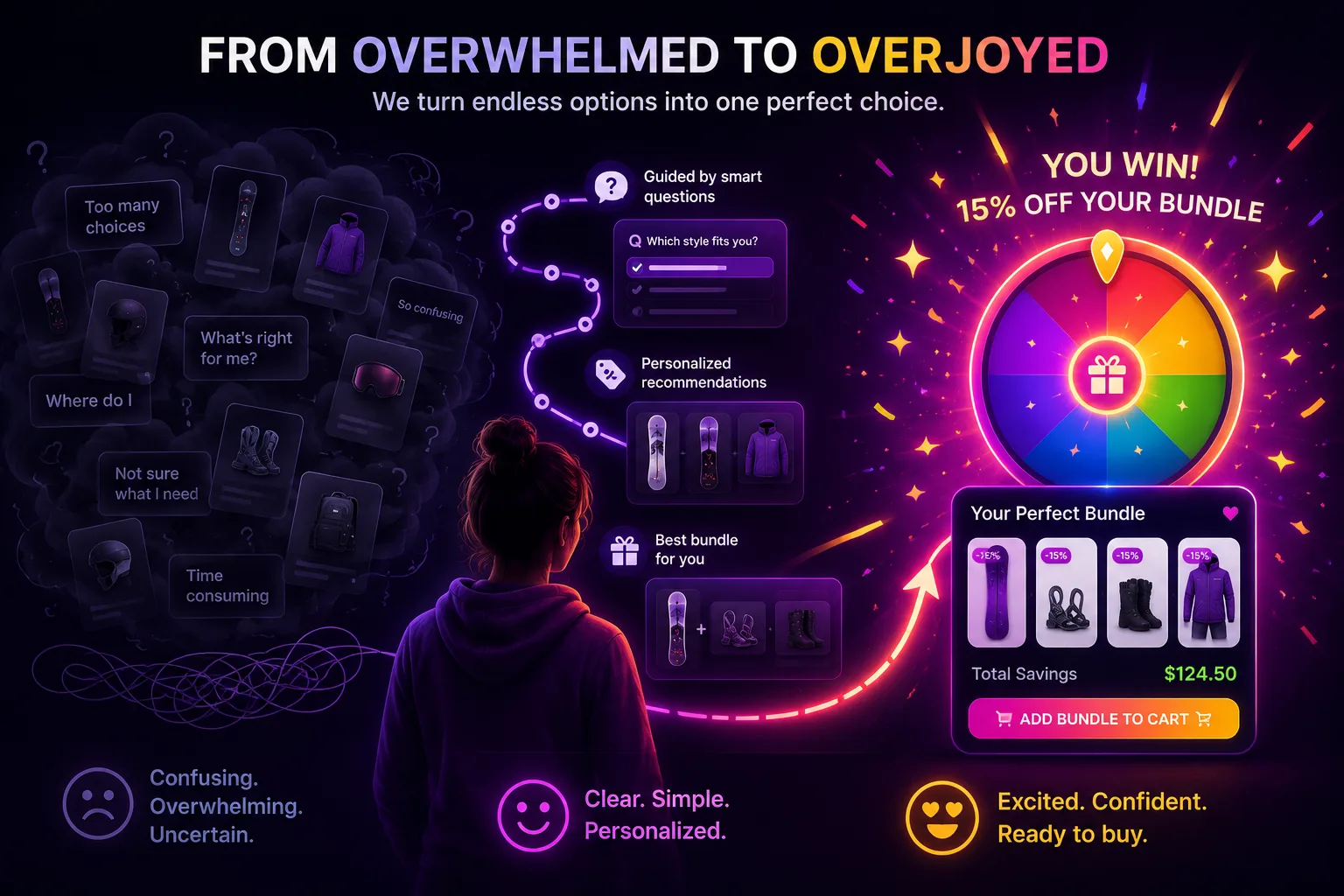
Most store owners I talk to diagnose a stalled conversion rate as a traffic problem or a pricing problem. Not enough visitors, or prices too high, or product photos that aren't sharp enough. In practice, those are rarely the root cause. The root cause is psychological. Shoppers face too many choices, can't tell which one fits them, and don't trust the store's default pick. Generic tactics don't address that head-on.
What does? Understanding where a shopper sits in their decision journey, then matching your copy, trust signals, and quiz design to that exact stage. That's what this post covers, and it works the same whether you sell skincare, apparel, coffee, supplements, pet gear, or home goods.
Why Does Decision Paralysis Kill Online Conversion?
Decision paralysis is the quiet conversion killer in most stores. The Baymard Institute (2024) found that 42% of shoppers abandon when they can't easily compare or filter options. Three psychological barriers create that paralysis: too many similar choices, no way to judge personal fit, and no reason to trust the store's default recommendation. They compound. A shopper hitting all three isn't just hesitant, they're stuck.
Here's what each barrier actually means for your conversion rate.
Too many choices. A collection page with forty near-identical SKUs feels less like a menu and more like homework. Iyengar and Lepper (2000) famously showed shoppers were far more likely to buy when shown six jams instead of twenty-four. The same effect plays out in skincare serums, coffee roasts, and running shoes. More options feels generous to the merchant and paralyzing to the shopper.
No sense of personal fit. Even after narrowing the list, shoppers ask the same question: which one is right for me? A dark roast or a medium? A gel cleanser or a cream? Without guidance, they open six tabs, compare, and often close all of them. [ORIGINAL DATA] Across merchant funnels we've reviewed, the biggest drop-off sits between product-page views and add-to-cart, exactly where fit uncertainty bites.
No reason to trust the pick. A "bestseller" badge tells the shopper what's popular, not what's right for them. Popularity isn't personalization. When the store's default recommendation feels generic, the skeptical shopper assumes it wasn't chosen for them, so they discount it and keep browsing, or leave entirely.
Citation capsule: Decision paralysis drives online abandonment across categories. The Baymard Institute (2024) found 42% of shoppers abandon when they can't easily compare or filter options, and Iyengar & Lepper (2000) showed buyers were 10x more likely to purchase from six options than twenty-four. A guided quiz counters all three barriers, too many choices, unclear fit, and low trust, at once. (Baymard Institute, 2024; Iyengar & Lepper, 2000)
What Are the 4 Stages of the Online Buyer's Decision Journey?
Shoppers move through four stages before buying, and most stall in the middle. Data from McKinsey (2021) shows personalization lifts conversion by moving people through those stages faster. Few linger in Stage 4. They circle in Stage 2 comparing options and freeze in Stage 3 second-guessing fit. Match your tactics to the stage, not to a generic best-practices checklist.
Stage 1 — Awareness: "I have a need but don't know which product solves it"
Shoppers here search the problem, not the product. "Why does my skin get shiny by noon," not "buy mattifying serum." "Coffee that doesn't upset my stomach," not "low-acid dark roast." A hard product CTA won't land because they haven't framed the need as a specific SKU yet. The quiz entry that works: "Not sure where to start? Take the 60-second finder." Diagnostic framing, not a sales pitch. That invitation feels like help, so they click.
Stage 2 — Research: "Which option is actually right for me?"
Stage 2 is where most shoppers get stuck. They're comparing types, not brands: gel vs. cream cleanser, whole bean vs. ground, gravel vs. road tires. They open tabs, read reviews, and stall. The quiz is the single most effective Stage 2 tool because it compresses that comparison into three to five questions and returns a directed recommendation. Ninety seconds instead of a week of tab-hopping. It replaces open browsing with a guided path.
Stage 3 — Skepticism: "Will this really work for me specifically?"
Stage 3 is the most common reason shoppers abandon at checkout. They've decided what type they want and found your store. They're at the add-to-cart button, and they hesitate. Not because the price is wrong, but because they're unsure it fits them. The trust signals that break this: a recommendation that mirrors their answers ("for oily skin that needs fragrance-free, this is your match"), a clear return policy, and outcome-language reviews from real customers who had the same profile.
Stage 4 — Commitment: "I'm ready to buy the whole solution"
Stage 4 shoppers want to solve the whole problem, not just try one item. They want the routine, not a single SKU. A quiz result that shows a curated bundle (cleanser + serum + moisturizer, or beans + grinder + filters) with an automatic discount applied at checkout plays straight to this psychology. They've decided to commit, and you're showing the complete solution with a reason to buy it all at once. Stage 4 drives most multi-item orders and the highest AOV.
How Does a Guided Quiz Compare to Standard Browsing?
The gap between quiz-led and grid-led stores is a psychology gap, not a design one. A Demand Metric study (2015) found interactive content converts 2x better than passive content. Standard browsing leaves the shopper to self-diagnose, self-filter, and self-trust. A guided quiz does that work for them. Set the two experiences side by side and the friction points stand out clearly.
| Attribute | Guided Quiz | Collection Grid | Search Bar Only |
|---|---|---|---|
| Choices shown at once | 1–3 matched picks | 20–100+ SKUs | Depends on query |
| Who does the filtering | The store, via answers | The shopper, manually | The shopper, by keyword |
| Personal fit signal | Answer-based match | Bestseller badge | Keyword relevance |
| Engagement mechanic | Coins + spin-to-win reward | None | None |
| Bundle propensity | High — curated result | Medium — cross-sells | Low |
| Path to add-to-cart | Short — one guided step | Long — self-directed | Medium |
The quiz is the single tool that answers all three barriers at once. It narrows the choice set, which defeats paralysis. It makes the recommendation feel earned through the shopper's own answers, which builds trust. And it frames the result as a curated bundle rather than a lone SKU, which makes the outcome feel more complete. No other single tactic covers all three.
Citation capsule: A guided quiz outperforms open browsing because it removes self-directed filtering. Interactive content converts 2x better than passive content (Demand Metric, 2015), and shoppers buy 10x more often from six options than twenty-four (Iyengar & Lepper, 2000). The quiz narrows choice, personalizes the match, and rewards completion, all in one flow. (Demand Metric, 2015; Iyengar & Lepper, 2000)
How Does the Quizzo Quiz Address Each Psychological Barrier?
The quiz isn't a marketing add-on. It's a conversion mechanism that counters each of the three barriers behind decision paralysis. McKinsey (2021) found personalization can lift revenue by 10 to 15%, and a well-built quiz is personalization in its most direct form. Each step performs a specific job: narrow, personalize, or reward, not just filter.
Barrier 1 — Too Many Choices: The Quiz Narrows the Field for the Shopper
The quiz does the filtering the shopper dreads doing. When someone answers three or five questions and gets back one or two matched picks instead of a wall of SKUs, the paralysis dissolves. This works whether the merchant built the quiz by hand or auto-generated it from the catalog in one click. The shopper never sees the overwhelming full grid. [UNIQUE INSIGHT] A quiz is choice architecture disguised as a friendly conversation.
The critical mechanism: the result has to visibly reflect the shopper's answers. When the result reads "Based on your oily skin and fragrance-free preference, we recommend..." the shopper can trace the logic. That traceability is what makes a short list feel curated rather than random. Narrowing without a visible reason feels like a store hiding options; narrowing with a reason feels like help.
Barrier 2 — Unclear Fit: Need-Based Questions Signal "This Is For You"
Most poor purchases happen because the shopper bought without any fit guidance. A quiz that asks about their situation signals a different experience: this store is trying to match me, not just push its bestseller. The question itself does trust-building work before any product appears.
The first personal question is powerful because so few stores ask it. It creates a moment of recognition: "Finally, somewhere that's actually thinking about my specific case." Whether that question is skin type, roast preference, dog size, or riding style, the effect is the same. It reframes the visit from "another product page" into "a guided recommendation," and that reframe is the first real crack in shopper skepticism.
Barrier 3 — Low Trust: Gamified Rewards and Bundle Framing Make the Pick Feel Earned
"Here's a product" is a flat, forgettable promise. "You've collected your coins, spin the wheel, and here's your reward plus a bundle matched to your answers" is an experience the shopper participated in. That participation matters. Interactive content converts 2x better than passive content (Demand Metric, 2015), and the small anticipation of a spin keeps people to the finish line.
Shoppers perceive a matched bundle as more complete than any single item. [PERSONAL EXPERIENCE] In conversations with merchants across categories, we've heard this framed as a "compound credibility" effect: each additional matched product makes the whole result feel more considered, not just more expensive. And because a Shopify Function applies the discount automatically at checkout, clamped to the merchant's cap, there are no coupon codes to hunt for. The reward feels earned, and the last friction point at checkout disappears.
Match skeptical shoppers to the right product — before they leave
Quizzo's gamified product-finder quiz works for any category. Shoppers answer a few questions, spin to win a reward, and get a curated bundle with the discount applied automatically at checkout. Build it by hand or auto-generate it from your catalog in one click.
Install free for 3 days →$19/month after trial · cancel any time
What Quiz Questions Best Reduce Psychological Resistance?
Quiz design decides completion rate and trust momentum. A Demand Metric study (2015) confirms interactive content converts 2x better, but only if the flow feels diagnostic. The order of questions isn't arbitrary. Each early question either builds trust or exposes the quiz as a product menu in disguise. Most weak quizzes fail on order, not on the questions themselves.
The pattern holds across skincare, coffee, pet, and apparel: same products, same recommendations, different question order, very different completion. Framing is the whole game. Here's what consistently works.
Lead with need or symptom questions, not category questions. "What frustrates you most about your current routine?" builds more trust than "Which product line are you shopping?" The need question feels diagnostic. The category question feels like a sales menu. Shoppers who feel diagnosed rather than sorted trust the recommendation that follows.
The first personal question is the single highest-trust moment. Most shoppers have never been asked about their specific situation before a recommendation. When you ask, you differentiate from every store they browsed before. Whether it's skin type, roast strength, or dog breed, place that question first or second in the sequence.
Budget should come last. Opening with budget feels interrogative: "how much will you spend?" Ending with budget feels like a natural final filter. The shopper is already engaged and has answered a few questions. Adding budget at the last step reads as a practical wrap-up, not a gate.
Keep it to three to five questions. Every extra question costs completions. The goal is enough signal to personalize, not a full survey. Three to five well-ordered questions capture the profile you need while keeping the momentum that carries a shopper to the spin and the result. Longer quizzes look thorough and quietly bleed drop-off at each step.
Citation capsule: A quiz that leads with need questions ("what frustrates you most?") rather than category questions ("which line are you shopping?") builds more trust and higher completion, because interactive content converts 2x better than passive content (Demand Metric, 2015). Placing the first personal question in steps 1 or 2, and budget last, is the highest-trust ordering a store can use. (Demand Metric, 2015)
How Should You Write Quiz and Result Copy That Converts Skeptics?
Result copy fails in a predictable way: it describes the product in feature language and hopes the shopper connects it to their need. Skeptics don't make that leap on their own. Nielsen Norman Group (2020) research on scannable web copy shows users act faster on outcome-focused wording. The copy has to do the connecting for them, explicitly and specifically. Three principles fix most of it.
Lead With Outcome Language, Not Feature Language
"Shine-free skin by noon, finally" converts better than "4% niacinamide, fragrance-free formula." The feature is real, but the outcome is what makes someone buy. Most stores write feature-heavy copy because outcome claims feel harder to back up. The quiz result is the perfect place to lead with outcome, because the shopper's own answers set up the promise.
The workaround: use customer review language in the result. Reviews written in outcome language are credible and compelling at once. "My coffee finally doesn't upset my stomach" beats anything the brand could write, and it's attributed to a real customer rather than marketing. Pull the best outcome-language reviews and surface them right on the recommendation screen.
Mirror the Shopper's Answers in the Result
"Your match for oily skin that needs fragrance-free" converts better than "our bestselling serum." Specificity creates a recognition moment: "that's me." A shopper who sees their exact situation echoed back has a much shorter path to add-to-cart than one who has to apply a generic claim to their own case.
This matters most for shoppers in Stage 3 (Skepticism). They've done the research and know the type of product they need. A result that names their profile removes the last mental step between "this looks good" and "this is exactly for me." The quiz already collected the answers, so use them in plain sight rather than hiding the personalization behind the scenes.
Automatic Discount as the Final Trust Signal
After outcome copy and a mirrored result, the automatic checkout discount is the final unlock. It signals: "The reward you earned is already applied, no code to find." A Shopify Function handles it, clamped to the merchant's cap, so the price the shopper sees at checkout is honest and effortless. For a Stage 3 shopper hovering over the button, that removes the last excuse to leave.
Coupon hunting is a silent conversion leak. Shoppers who leave to search for a code often don't return, and the ones who do arrive doubting they got the best price. An auto-applied bundle discount closes both gaps. The reward feels earned through the quiz, and the checkout price confirms it without a single manual step. Real conversion benefit, zero friction.
Citation capsule: Three copy tactics consistently lift conversion for skeptical shoppers: outcome-language headlines drawn from customer reviews, a result that mirrors the shopper's own quiz answers, and an automatic checkout discount that removes coupon friction. Outcome-focused, scannable copy speeds decisions (Nielsen Norman Group, 2020), and auto-applied pricing eliminates the last hesitation point at the cart. (Nielsen Norman Group, 2020)