Why Traffic Without Sales Is a Conversion Problem, Not a Traffic Problem
The average Shopify store converts at 1.3% to 1.4%. That means for every 100 people who visit your store, roughly 99 leave without buying. The top 10% of Shopify merchants convert at 3.5% or higher.
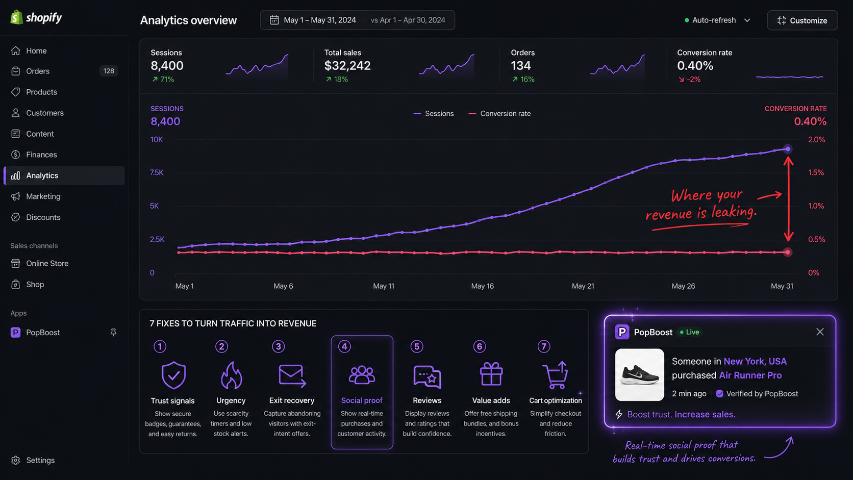
If you're getting consistent traffic — from ads, from SEO, from social — but almost nobody is buying, the instinct is to think you need better traffic. More targeted ads. Better keywords. A different audience. Usually, that instinct is wrong.
The real problem is almost always what happens after the visitor arrives. The traffic found you. They're interested enough to click. Then something on your store kills the sale before it happens.
The seven reasons below cover 90% of cases. Most stores have two or three of them at once. Each has a specific fix. Some take five minutes. Some take an afternoon. None require a full store rebuild.
| Symptom | Likely Cause | Fix |
|---|---|---|
| High bounce rate on product pages | No immediate trust signal | Add social proof popup + review stars |
| Visitors leave at cart | No urgency or discount incentive | Add exit-intent popup with discount |
| Low add-to-cart rate | No scarcity or social validation | Add low-stock badge + recent purchase popup |
| Good CTR from ads but no purchase | Landing page mismatch | Match ad offer to announcement bar message |
| High cart abandonment | No recovery mechanism | Add free shipping progress bar + exit intent |
| Repeat visitors who never buy | Unclear value proposition | Add countdown timer to create purchase deadline |
| Mobile sessions convert < half desktop | Mobile UX issues | Check all widgets render correctly on mobile |
Reason 1: Visitors Don't Trust You
No Trust Signals at the Point of Decision
When a visitor lands on a product page and sees no reviews, no recent purchase activity, and no external validation — the mental calculation defaults to "I don't know this brand, I'll Google the reviews first." That tab never comes back.
Trust is earned contextually. It's not enough to have good reviews somewhere on your site. They need to appear at the exact moment a visitor is deciding whether to add to cart.
The most effective trust signal for in-session conversion is real-time social proof: a notification that shows what other people are buying right now. "Sarah from Austin just purchased the Linen Bundle Set." That's not a review — it's live evidence that your store is active and real people trust it enough to hand over money.
Studies show that social proof popups lift conversion by 10–25% on product pages. The mechanism is herd behavior — one of the most deeply wired human decision shortcuts. If others are buying, it's safe to buy.
Reason 2: There's No Reason to Buy Today
Visitors Are Deferring the Decision to "Later"
"I'll come back to this." That's the most dangerous sentence in ecommerce. In practice, "later" almost never happens. Visitors who leave without buying return less than 8% of the time without a retargeting ad to bring them back.
The human brain is wired to defer decisions that don't feel urgent. When a product is available today, tomorrow, next week, and next month at the same price with no time pressure — there is no rational reason to buy right now. So visitors don't.
Urgency has to be real to work. Fake evergreen countdown timers that reset every time you visit were a 2017 tactic. Modern shoppers recognize them and they actively destroy trust. Real urgency means: an honest sale that actually ends, a limited quantity that genuinely runs out, or a product that's new enough to have cultural relevance that fades.
Reason 3: Your Product Page Isn't Answering the Real Objection
The Description Is Talking About the Product, Not the Buyer's Fear
Most Shopify product descriptions list features. Weight. Material. Dimensions. What the product does. This is the wrong level of abstraction for conversion.
When someone is on your product page and not buying, they have an objection that isn't answered. That objection is almost always one of these:
- "Will this actually fit / work for my specific situation?"
- "Is this quality worth the price?"
- "What happens if I don't like it — will returning be a nightmare?"
- "Is this brand legit or will it disappear in a month?"
None of those objections are answered by "100% premium cotton, 230 GSM." They're answered by specificity, by showing the product in use across different contexts, and by making the return/guarantee policy impossible to miss.
Reasons 1 and 2 are the easiest wins on this list
No store rebuild needed. PopBoost adds social proof popups, countdown timers, and low-stock badges in minutes — each one targets a specific reason visitors don't convert.
Add Trust and Urgency Free →Reason 4: You're Not Recovering Abandoning Visitors
Letting 95% of Visitors Walk Out Without a Last Attempt
Even the best-optimized Shopify stores lose 96–98% of visitors. The question is whether you make one last attempt before they go, or let them leave silently.
Exit intent technology detects the micro-behavior that precedes leaving: on desktop, the cursor moving toward the browser's top bar or close button. On mobile, a rapid upward scroll — the gesture that happens before tapping the back button. When detected, you have a fraction of a second to show something that changes the calculation.
Exit popups work because they interrupt the leaving behavior without being disruptive to the browsing experience (they only fire once, at the moment of exit). The offer doesn't need to be a discount — sometimes it's a free shipping threshold reminder ("You're $12 from free shipping — want to add something?"), a product recommendation, or simply a last trust-building message.
Reason 5: The Free Shipping Threshold Is Invisible
Shoppers Don't Know They're $15 Away from Free Shipping
Free shipping is the single most powerful AOV lever in ecommerce — but only if shoppers know the threshold exists and can see how close they are to hitting it.
The average shopper will add items to their cart specifically to reach free shipping. A study by NRF found that 65% of shoppers look up a retailer's free shipping threshold before placing an order. If that threshold isn't prominently displayed throughout the shopping session, you're getting none of the AOV lift and none of the conversion motivation.
Most stores bury free shipping information in the footer or on the cart page — neither of which is where the buying decision is made. The decision happens on the product page, and on the collection page as a shopper is scrolling through options.
Reason 6: Your Buy Button Is Losing the Competition
The "Add to Cart" Button Isn't the Visual Priority on Your Page
On a product page, one thing should dominate: the path to purchase. Everything else — navigation, related products, lifestyle photos, cross-sells — is a distraction unless it actively moves visitors toward that button.
The most common UX mistakes that suppress conversion:
- The "Add to Cart" button is below the fold on mobile — visitors have to scroll to see it
- The button color blends with the page background (a gray button on a gray page)
- There are multiple competing CTAs at the same visual weight ("Add to Cart", "Add to Wishlist", "Compare", "Save for Later")
- Variant selectors are confusing or require too many steps before the button appears
- The page loads slowly — every extra second of load time costs 7% conversion
On mobile (which now drives 60%+ of Shopify traffic), the buy button often scrolls completely off screen before visitors have finished reading the product name. A sticky "Add to Cart" bar that follows the user as they scroll fixes this immediately.
Reason 7: Your Pricing Signals the Wrong Thing
The Price Appears, But the Value Doesn't
Price without context is a conversion killer. When a visitor sees "$89" and has nothing to compare it to, their brain generates its own comparison — usually the cheapest thing they've seen recently. You lose that comparison by default.
Anchoring — the practice of showing a higher reference price before the actual price — is one of the most consistently validated findings in behavioral economics. A product shown as "$89 (was $130)" converts better than the same product at "$89" with no reference point, even when the shopper doesn't consciously believe the "was" price was real.
The bundle price structure is a related opportunity. "Buy 3 for $70 (save $17)" converts better than individual pricing even when the math is equivalent, because it frames the purchase as a savings decision rather than a spending decision.
Quick Audit: Diagnose Your Store in 10 Minutes
Before adding anything new, run this audit on your three highest-traffic product pages. Check each item on a real mobile device, in a private browser window (so you see what a first-time visitor sees).
Trust signals audit
- Does a social proof notification or recent purchase popup appear within the first 10 seconds?
- Are product reviews visible above the fold on mobile?
- Is your return/guarantee policy stated somewhere on the product page (not just in the footer)?
- Does your store look active? (Recent reviews, visible stock movement, populated wishlist counts)
Urgency audit
- Is there any time or scarcity signal on the product page?
- If you're running a sale, is there a countdown showing when it ends?
- If a variant is low in stock, is that communicated clearly?
- Is urgency honest — does the sale actually end, does the low stock reflect real inventory?
UX audit
- Is the "Add to Cart" button visible without scrolling on a mobile device?
- Is the buy button a visually distinct color (not gray, not the same as the page background)?
- Is there a free shipping threshold bar visible in the header or product area?
- When a visitor moves to exit, does anything attempt to recover them?
Pricing audit
- For products on sale, is the compare-at price displayed and is the savings % visible?
- If you sell complementary products, is there a bundle offer that makes saving obvious?
- Is your pricing consistent — does the same product show the same price in the cart, checkout, and product page?
How a Jewelry Store Went from 0.9% to 3.2% Conversion Rate
A Shopify jewelry brand was spending $4,000/month on Facebook ads and converting at 0.9%. Their product pages had no reviews visible, no urgency signals, no exit recovery, and their free shipping threshold ($75) was only mentioned in the footer.
They ran the audit above, identified all four gaps, and installed PopBoost to fix them simultaneously: social proof popup pulling from real purchase data, low-stock badge on their best-sellers, exit intent with a "10% off first order" offer, and a free shipping progress bar.
Result: conversion rate climbed to 3.2% in 45 days. Same ad budget, same traffic, 3.5x more revenue from that traffic.
What to Fix First
If you found two or three gaps in the audit above, don't try to fix everything at once. Prioritize in this order:
- Trust signals first — social proof is the fastest way to lift conversion from a cold audience that doesn't know your brand
- Exit recovery second — you're already losing these visitors; an exit popup has zero downside
- Free shipping bar third — directly visible AOV lift with no discount required
- Urgency fourth — add countdown timers and low-stock badges only if you have real time pressure to communicate
- Product page copy and pricing — these require more time but compound with everything above
Reasons 1, 2, 4, and 5 from this list can be fixed with a single app install. Reasons 3, 6, and 7 require store editing but don't require code. The full fix list takes a weekend, not a rebuild.
Start with the 4 fastest wins
PopBoost adds social proof popups, urgency widgets, exit intent recovery, and a free shipping bar to your Shopify store — all from one app, in under 10 minutes, free to install.
Install PopBoost Free on Shopify →Frequently Asked Questions

PopBoost ‑ FOMO & Popups
7 Shopify conversion widgets. One $19/month app.