- Average Shopify conversion rate: 1.4–1.8%. Top 10% stores: 4.7%+ (Littledata, 2024).
- 75% of shoppers rely on product images when deciding whether to buy (Baymard via Convertcart, 2024).
- Real stock-level display increases conversions by up to 17.8% (CXL, 2024).
- A 1-second page load delay cuts conversions by 7% (SOASTA/Deloitte).
- Exit-intent popups with a countdown timer convert at 14.41% (Wisepops, 2025).
This post focuses specifically on the product page layer of Shopify conversion rate optimization. Product pages are where purchase decisions are finalized. Everything else in your funnel exists to get visitors here. What happens on this page determines your revenue.
Shopify Conversion Rate by Optimization Level
Source: Littledata 2024-2025 & composite estimate
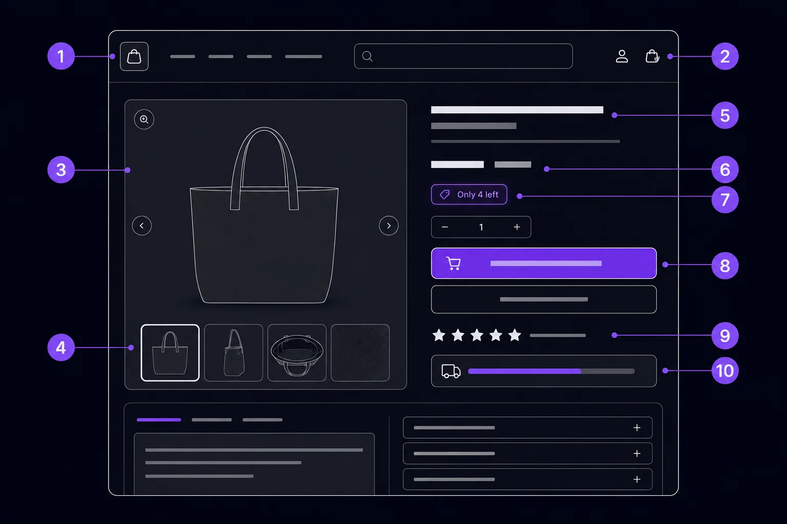
#1 - Product Images: The Conversion Foundation
Product images are the single most influential element on a product page. 75% of online shoppers rely on images when making a purchase decision (multiple ecommerce sources, 2024). Baymard benchmarks recommend 4–8 images per product listing, and high-performing stores show 6 or more interactions with images as a distinguishing pattern (Baymard via Convertcart, 2024).
Image checklist: what to shoot
Include these angles per product: white-background hero shot, at least one lifestyle or in-use image, a close-up detail view, a size-reference image (product next to a known object or on a model), and a packaging or unboxing image. Stock photography consistently underperforms original product photography in every conversion test. Shoot your own.
Format matters too. Shopify automatically serves WebP when browsers support it, but your source uploads set the ceiling. Upload images at 2048x2048px — large enough for the built-in zoom feature, but not so large that download time climbs on mobile. Enable zoom on the product gallery. Visitors who zoom are far more likely to add to cart; zooming is a strong purchase-intent signal.
Short-form video belongs here as well. Product pages with autoplay video under 30 seconds see a 94% average conversion uplift (Wyzowl ecommerce video study, 1,500 retailers, cited via amraandelma.com, 2025). That's not a typo. A 30-second clip showing the product in use, demonstrating a key feature, or showing scale relative to a person can double conversion on products where appearance and function aren't obvious from static images.
#2 - Product Title and Description: Clarity Over Cleverness
A clear title that names the product directly outperforms a clever headline in almost every product category. The title should include the primary benefit or defining attribute, not a brand-invented name that means nothing to a first-time visitor. Keep the title to 60–80 characters so it displays fully in mobile search results and social shares.
The description needs a different approach for mobile versus desktop. On mobile, only the first 150 characters appear before a "Read more" collapse. That opening line carries more weight than all the copy that follows. Lead with the strongest benefit statement. Don't start with "Introducing..." or the brand name. Start with what the product does for the buyer.
Structure the rest of the description with bullet points for specs and features. Prose paragraphs bury the information customers are scanning for. Bold the words that answer purchase questions: material, dimensions, weight, compatibility, care instructions. Answer objections within the description itself: if customers ask "Will this fit a full-size bed?" in your reviews, put the answer in the description so the next visitor doesn't have to ask.
#3 - Pricing Display and Trust Anchors
How you display price affects perceived value as much as the price itself. Loss aversion anchoring works reliably: showing the original price alongside the sale price ($89 ~~$120~~) makes the current price feel like a win. Customers perceive they're saving $31, not spending $89. This framing lifts conversion on discounted products without changing the actual discount.
Three trust anchors belong below the price on every product page. First, a money-back guarantee badge: "30-day hassle-free returns" addresses the buyer's fear of making a wrong decision. Second, a secure checkout badge: "Secure checkout - SSL encrypted" reduces payment anxiety for first-time buyers. Third, accepted payment method icons (Visa, Mastercard, Shop Pay, PayPal) reduce friction by confirming their preferred payment method works before they commit to the cart.
For stores selling internationally, currency matching matters. Showing prices in the visitor's local currency reduces abandonment caused by currency conversion confusion. Shopify Markets handles this automatically. Don't make international customers do math.
Does social proof still drive Shopify product page conversions in 2026?
Yes, more than ever. 95% of people check product reviews before making a purchase (Nudgify, 2024). And 88% of consumers trust online reviews as much as personal recommendations (OptinMonster via Convertcart, 2024). Reviews aren't a nice-to-have on a Shopify product page. They're a baseline requirement for conversion.
Social proof placement: above the fold on mobile
Move the star rating and review count to directly below the product title, above the description. Most Shopify themes place reviews at the bottom of the page. That's wrong for conversion. Visitors should see "4.8 stars (312 reviews)" before they read a single word of your product copy. The rating validates that the product is worth their attention.
Static reviews handle one layer of social proof. A social proof popup handles another. PopBoost's social proof popup displays a recent purchase notification ("Sarah from Austin just bought this") in the bottom corner of the page. This activates herd behavior: seeing that other real people are buying right now reduces hesitation. See the complete social proof guide for placement data and setup steps.
User-generated content photos in the review section also lift conversion. Reviews with photos convert better than text-only reviews because they provide the visual proof that product images alone can't offer. If your review app supports photo uploads, enable them and prompt buyers to include photos in your post-purchase email.
Do urgency and scarcity signals actually work on Shopify product pages?
Real urgency signals work significantly. Displaying real-time stock levels increased conversion rates by up to 17.8% in high-traffic stores (CXL study via capitalandgrowth.org, 2023-2024). The critical qualifier: real. Fake "Only 3 left!" shown when you have 500 units in the warehouse destroys trust when customers catch it. And they do catch it.
Stock countdown: show it at 5 units or fewer
Configure PopBoost's stock countdown to display only when inventory drops to 5 or fewer units for the selected variant. The widget reads directly from Shopify's inventory data — no manual updates needed. Placement: directly below the Add to Cart button, in a contrasting color that draws the eye without competing with the button itself.
Countdown timer: for real sale end dates only
A countdown timer on a product page should reflect a real event: a sale that ends at a specific time, a flash deal, or a limited-time bundle price. Never use an evergreen timer that resets on every visit — customers notice, and the signal loses all credibility. Configure PopBoost's countdown timer with your actual sale end date and remove it when the promotion closes. See the countdown timer setup guide for configuration details.
Together, stock countdown and countdown timer cover two distinct urgency motivations: inventory scarcity ("this specific item is running out") and time scarcity ("this price won't last"). Placement for both: immediately below the Add to Cart button, above the trust badges.
5 of these 10 elements, one app
PopBoost handles stock countdown, countdown timer, social proof popup, free shipping bar, and exit-intent popup — all from a single $19/month app. 14-day free trial, no credit card required.
Install PopBoost free →14-day free trial · no credit card required · works with all Shopify themes
#6 - The Add to Cart Button: Your Highest-Stakes Element
The Add to Cart button is the final conversion action on a product page. Every friction point you've removed up to this point was building toward this click. The button needs to be visually dominant, physically easy to tap on mobile, and labeled with text that matches the buyer's mindset at that moment in their journey.
Color contrast, size, and label — the three non-negotiables
Color contrast: the button must pass WCAG AA contrast requirements against the page background. A purple button on a white page works. A light gray button on a white page fails. Use a contrast checker if you're unsure. Size: minimum 44x44px tap target on mobile. Apple's Human Interface Guidelines specify this for a reason — a smaller target produces miss-taps and frustration. Label: "Add to Cart" consistently outperforms "Buy Now" for consideration-stage products where visitors are still evaluating. "Buy Now" works better for impulse items with simple decisions.
On mobile, a sticky Add to Cart bar solves one of the most common product page problems: the button scrolling out of view. When a visitor scrolls through your product description, images, and reviews, the ATC button disappears. A sticky bar that stays at the bottom of the viewport keeps the conversion action visible at all times. Most premium Shopify themes support this natively; if yours doesn't, it can be added via a theme app extension.
Remove competing CTAs from the same viewport as the Add to Cart button. A product page with three equally prominent buttons ("Add to Cart," "Save to Wishlist," "Share," and "View Similar Products") splits attention across four options. The result is less action on the most important one. The Add to Cart button should be the only high-contrast action visible on first load.
How does the free shipping bar affect Shopify product page conversion?
Unexpected shipping costs at checkout are the leading cause of cart abandonment — Baymard's research puts it as the top abandonment reason, affecting a significant share of cart abandoners. Displaying shipping costs (or free shipping eligibility) on the product page eliminates the surprise that kills checkout completion. A free shipping progress bar on the product page motivates the first add-to-cart and the second item in the cart.
Free shipping bar: show it on product pages, not just cart
Most stores show the free shipping threshold only in the cart. That's too late. Display the progress bar on product pages so customers know what threshold they're working toward before they add the first item. Set the threshold 15–25% above your current average order value to create a stretch goal most customers can reach with one more item. See the free shipping bar guide for threshold calculation and placement options.
The announcement bar position at the top of the page is the most visible placement for a sitewide free shipping message. PopBoost's free shipping bar widget handles both: a progress bar on product and cart pages, and a static announcement bar for sitewide threshold messaging. Both update in real time as the cart changes.
Why is mobile product page optimization different from desktop?
Mobile Shopify visitors convert at roughly 1.2% while desktop visitors convert at 1.9% (Littledata, 2024). That gap exists because most product pages were designed on desktop and tested in Chrome DevTools — not on an actual iPhone held in one hand. The mobile product page experience has specific failure modes that desktop design doesn't catch.
The mobile product page checklist
Test these on a real iPhone (not DevTools): tap targets are thumb-friendly (44px minimum), no horizontal scroll anywhere, description collapses with "Read more" to avoid excessive scrolling, image gallery swipes naturally with touch, sticky Add to Cart bar visible at all times, and the price and trust badges appear above the fold before any scrolling. Fix anything that fails. Then test on Android too.
53% of mobile users abandon sites that take longer than 3 seconds to load (Google, 2023-2024). Mobile speed and mobile UX are separate issues, but both hit the 1.2% conversion rate. Address UX first (layout, navigation, tap targets) because those are free to fix. Address speed second because it requires technical work. Both matter.
#9 - Page Speed: The Silent Conversion Killer
A 1-second delay in page load reduces conversions by 7% (SOASTA/Deloitte, via Wiro Agency). Shopify stores loading in under 1 second have a 2.5x higher conversion rate than stores loading in 5 seconds (Shopify analysis, 2024). Speed isn't a "nice to have" performance metric. It's a direct revenue lever.
The Shopify product page speed checklist
Run Google PageSpeed Insights on your product page URL (not your homepage — product pages often score differently). Target: LCP under 2.5 seconds on mobile (Core Web Vitals "Good" threshold). The five fastest wins on Shopify: (1) compress and convert images to WebP, (2) uninstall apps you're not actively using — their storefront scripts persist after you stop using the admin panel, (3) use Shopify's built-in CDN for all assets, (4) defer non-critical JavaScript, and (5) enable lazy loading on below-the-fold images. Shopify's Dawn theme and its derivatives are Core Web Vitals optimized by default.
Each installed Shopify app that adds a storefront script adds load time. A store running 15 apps often has 10 scripts firing on every product page load. Audit them. Keep only what's actively contributing to conversion. This is one reason why an all-in-one app replaces several single-purpose apps: PopBoost delivers 7 conversion widgets as a single Theme App Extension, replacing what might otherwise be 5 separate scripts.
#10 - Exit-Intent Recovery: The Last Chance Before They Leave
Even a perfectly optimized product page loses the majority of visitors. Exit-intent recovery is the last intervention before someone leaves. An exit-intent popup with a compelling offer converts an average of 3.94% of triggering visitors. Add a countdown timer to that popup and conversion climbs to 14.41% (Wisepops, 1 billion displays analyzed, 2025).
Exit-intent on product pages specifically
Configure exit intent to fire on product pages and the cart page only — these are where real purchase intent exists. A visitor leaving your homepage has shown little intent. A visitor leaving a product page after 30 seconds of reading is a genuine recovery opportunity. Use a first-purchase discount offer (10–15%) or a free shipping unlock. Pair it with a countdown timer: "Your 10% off expires in 10:00." This combination delivers the highest exit-intent conversion rates observed in the Wisepops data. See the full exit-intent popup guide for offer configuration and session cap settings.
Complete Shopify Product Page Checklist
Use this table to audit every product page in your store. Prioritize items marked High impact that you haven't implemented yet.
| Element | What to check | Tool / Where | |
|---|---|---|---|
| ✓ | #1 Images | 4–8 images, lifestyle shot, zoom enabled, WebP format | Shopify product editor, Canva/photography |
| ✓ | #2 Title & Description | Benefit-led title, first 150 chars answer the key question, bullet specs | Shopify product editor |
| ✓ | #3 Pricing & Trust Anchors | Original/sale price shown, money-back badge, secure badge, payment icons | Theme settings, trust badge app |
| ✓ | #4 Social Proof & Reviews | Star rating visible above fold, review count displayed, social proof popup active | Judge.me / Loox / Okendo, PopBoost |
| ✓ | #5 Urgency & Scarcity | Stock countdown at ≤5 units, countdown timer on real sale events | PopBoost stock countdown + timer |
| ✓ | #6 Add to Cart Button | WCAG AA contrast, 44px+ tap target, sticky on mobile, no competing CTAs | Theme settings, browser contrast checker |
| ✓ | #7 Free Shipping Bar | Threshold 15–25% above AOV, bar visible on product pages and cart | PopBoost free shipping bar |
| ✓ | #8 Mobile UX | Tested on real iPhone, sticky ATC, collapsed description, thumb targets | Manual test on device |
| ✓ | #9 Page Speed | LCP <2.5s mobile, WebP images, unused app scripts removed | PageSpeed Insights |
| ✓ | #10 Exit Intent | Popup fires on product page exit, offer set, countdown timer enabled | PopBoost exit-intent popup |
PopBoost adds 5 of these 10 elements instantly
Stock countdown, countdown timer, social proof popup, free shipping bar, and exit-intent popup. One app. $19/month. Works with all Shopify themes — no code required.
Install PopBoost free →14-day free trial · no credit card required · 7 conversion widgets included
Frequently asked questions about Shopify product page optimization
What is a good conversion rate for a Shopify product page?
The average Shopify store converts at 1.4–1.8% (Littledata, 2024). Top 20% of stores hit 3.2%+, and the top 10% reach 4.7% or higher. A well-optimized product page with all 10 elements in place can push a store from average into the top 20%. If your product page is below 1.5%, start with images, reviews, and trust signals before anything else.
How many product images should a Shopify product page have?
Baymard benchmarks recommend 4–8 images per product. High-performing stores show 6 or more, including a lifestyle shot, a close-up detail view, a size-reference image, and a packaging image. Visitors who interact with 6 or more images consistently show higher add-to-cart rates than those who view 3 or fewer (Baymard via Convertcart, 2024). Don't pad with low-quality images — 6 strong images beat 10 weak ones.
Does page speed really affect Shopify product page conversions?
Yes, directly. A 1-second load delay reduces conversions by 7% (SOASTA/Deloitte). Stores loading in under 1 second convert at 2.5x the rate of stores loading in 5 seconds (Shopify, 2024). And 53% of mobile users abandon sites that exceed 3 seconds (Google, 2024). The main Shopify speed levers: image compression to WebP, removing unused app scripts, and targeting LCP under 2.5 seconds on mobile.
Where should the Add to Cart button be placed on a Shopify product page?
Above the fold on desktop, alongside the product images and price, without scrolling. On mobile, a sticky Add to Cart bar at the bottom of the viewport keeps the conversion action visible as visitors scroll through content. Minimum tap target: 44x44px. High color contrast (WCAG AA). Label: "Add to Cart" for consideration-stage products, "Buy Now" for impulse items. Remove competing CTAs from the same viewport.
Do urgency widgets like stock countdowns really work on Shopify?
Yes, when the data is real. Displaying genuine stock levels increased conversions by up to 17.8% in high-traffic stores (CXL study via capitalandgrowth.org, 2024). The requirement is honesty: show stock countdown only when inventory is genuinely low (5 units or fewer for the selected variant). Fake scarcity signals destroy trust when customers notice them — and they do. Use a widget that reads from your live Shopify inventory data, not a static number you set manually.
For a broader view of all store conversion levers beyond the product page, see the complete Shopify CRO checklist. For the social proof layer specifically, the social proof guide covers review strategy, purchase notification placement, and UGC integration in detail. For announcement bar setup, see the Shopify announcement bar guide.
